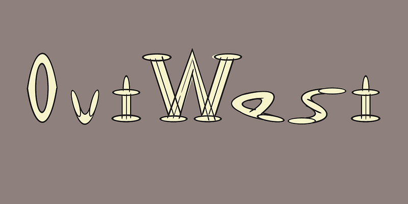
Outwest
One of Ed Fella’s most iconic and unconventional alphabets is “OutWest,” a hand-drawn type design that exemplifies his experimental approach to typography. Originally commissioned by art director Laurie Haycock Makela for the Walker Art Center’s Design Quarterly, OutWest was never intended to function as a standard typeface. Instead, it represents Fella’s interest in the expressive and deconstructed nature of letterforms. He created the design by hand, using an architectural template and a fifteen-degree ellipse, which informed the letterforms’ distinct curved and angular shapes. Fella titled the piece “Out West on a Fifteen Degree Ellipse,” a name that captures both the geometric precision and the rugged, organic quality reminiscent of Western vernacular signage. The type design breaks from tradition with uneven baselines, exaggerated serifs, and varying line thicknesses, embracing distortion as a deliberate visual strategy. Influenced by Art Nouveau, punk zine culture, and Dadaist aesthetics, each letterform stands alone as a miniature artwork. Rather than prioritizing legibility, Fella uses the alphabet as a means of visual storytelling, emphasizing the idea that typography can be both expressive and conceptual. Though not a digital font, OutWest holds an important place in design history for pushing the boundaries of typographic form and inspiring generations of postmodern designers to see type as a form of visual art.